Two years ago, when we began analyzing data about criminal court case outcomes in Harris County, we had a sense that the data would be useful for all types of criminal justice advocates. But most criminal justice advocates aren't statistical programmers.
That's why we built the Data Dashboard. It's an interactive tool that helps advocates track cases and trends through Harris County’s criminal court system. Anyone can log on and explore the numbers by charge, race, gender, and more.
But it's not enough to put the data visualization out there in the world. We wanted people to use it. We wanted to hear feedback. So we developed a webinar for criminal justice advocates to learn how to use the dashboard and to ask questions.
The best part of this process has been meeting the different types of criminal justice advocates in the community. From policy wonks to 8th grade students, we’ve had the chance to hear what kinds of questions they want to ask of the data.
Here are the top five lessons we learned:
1. The dashboard has to be intuitive. When someone loads the dashboard for the first time, they probably aren't going to read the instructions. The dashboard should be easy to use, and it has to be obvious what to do first.
2. The dashboard has to be fast. Users will provide a little bit of slack because this is a data-intensive app, but we have to fine tune the performance to make the most of every millisecond.
3. We can't do everything at once. We’ve heard lots of suggestions for enhancing this dashboard with pretrial or juvenile data, but those are projects that can stand on their own. It's critical to find a place for all the good ideas, even if it's not within this application.
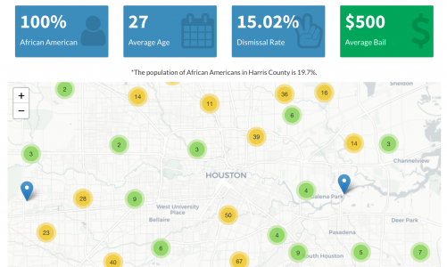
4. We must do the first analysis. It's important to have a model for how to use the dashboard, so we performed the first analysis using marijuana cases. As you’ll see in the webinar, we were able to outline, step by step, how to use the dashboard and how to recreate our findings.
5. We must keep it fresh. We make data updates every month, and there are new ideas for analysis all the time. We keep using the dashboard to explore our own ideas, and since the data is current, the application stays relevant.
Are you using the Harris County data in your analysis? We'd love to hear from you.